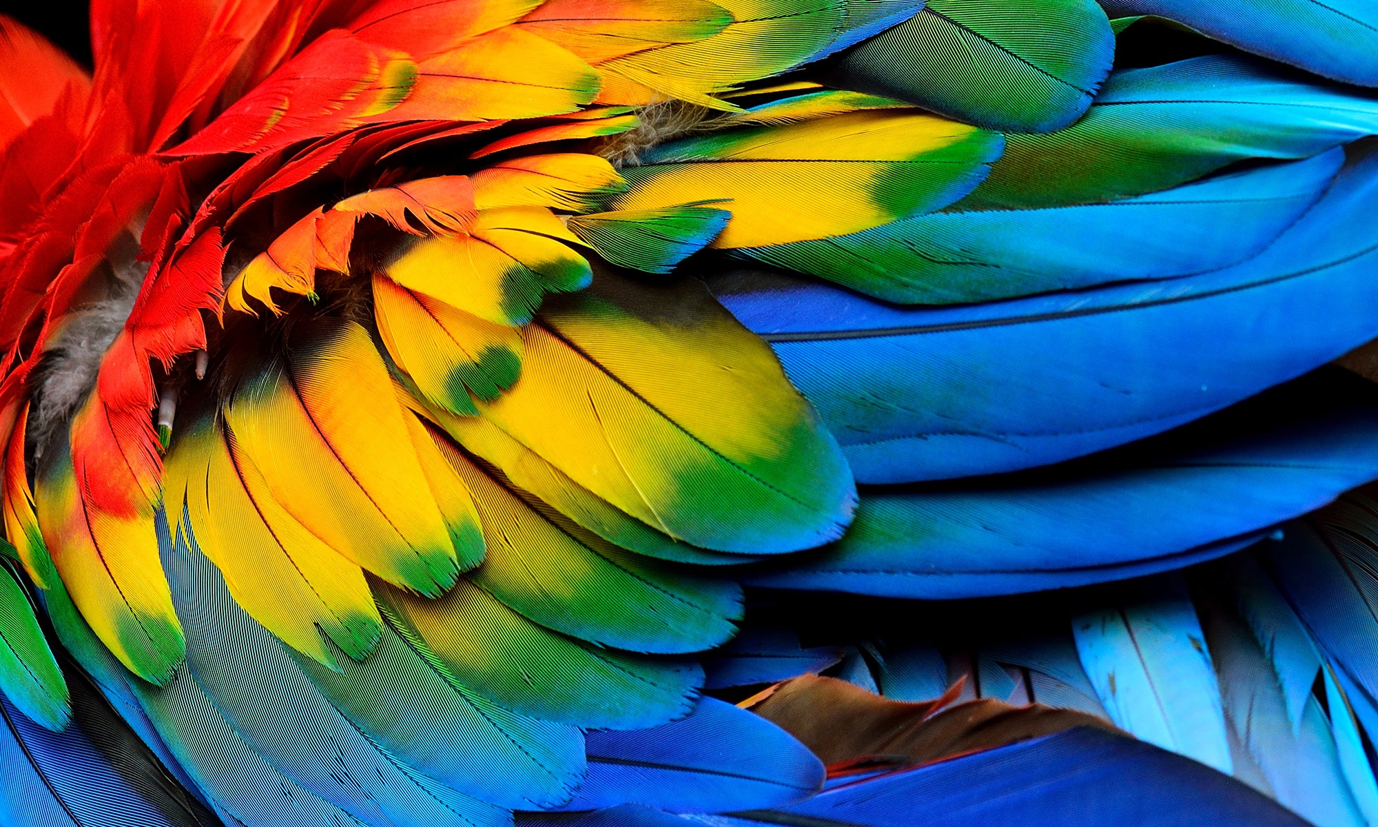
Emotional colours
Imagine the first time your potential customers see your brand – either a clinic, website, photograph or even yourself as a representative.
What five Key emotional triggers would you want this new potential customer to experience?
It is said that it is impossible to experience more than one emotion at any one time – more often than not we move from one to another. When we come close to this it's called synesthesia.
Consider five potential key emotional triggers for you brand. Now think about what colour you would associate with each of the trigger. For example if you wanted to elicit the feeling of secure, you might propose Blue as a colour that can be associated with this.
Do this with all the key emotional triggers then consider what, as a practice you would need to do to encourage these feelings in your customers Behaviours, decor, tone of voice and so on. Once you have interrogated these to the nth degree, ask yourself is the first colour I thought of still relevant? Do the colours best represents each of these triggers? Allow these colours to be in alignment with you, what you think and also what you believe your audience would think.
Below is a list of colours and possible meanings. It is important to remember that each colour can have a different tone in much the same way as a person or brand can. A deep hard red, can be tinted to a softer warm red and a drk purple warmed to an aubergine and further still to a violet.
White Palette
Devine, purity, eternal, light, clinical, minimal, clean, ivory white exclusive, rare, exclusive
Silver Palette
Modern, space travel, futuristic, elegant, trustworthy, valuable
Gold Palette
Divinity opulence luxury rarity timeless, greed, envy
Yellow Palette
Positive, fun, exciting, happy, orange yellow Saffron, expensive
Orange Palette
Warm and safe, energy, creative, homely, reassuring, tangy, bright, Healthy, daring risky, clear, warming
Pink Palette
Flesh tone, generally considered feminine today, soft, romantic, caring, calming
Fluorescent Palette
Pinks, orange and yellows stand for power and attention. Artificial
Magenta Palette
Creative, fun, exciting, daring, intense, vivacity, enjoyment
Red Palette
Passion, love, romance, power, aggression, love, good luck, joy and fortune, strength and fortitude, winning, danger
Purple Palette
Powerful, wealthy, rich, intense, status
Blue Palette
Trustworthy, fresh, clear, cool, coveted. Anonymous, professional, wealthy, clean, peaceful, heavenly, ideas, free-thinking, relaxing
Green Palette
Environment, luxury, sporty, style: racing green; fresh, life giving, growth, youthful, young, green rare, magical, clean, healthy, calm
Browns Palette
Rich and earthy, poor, dirty, unclean, muddled, filthy. Umber can be seen as rich and steadfast, Inoffensive lighter tones such as beige
Grey/Taupe Palette
Inoffensive, class, grey natural, warm stone. Refined, elegant
Black Palette
Elegant, timeless, fashion, sadness, mourning, classical, prestige, beginnings, peace, contrast and clarity. Can also mean power, danger
Colour Wheel
A colour wheel is a graphic that identifies 12 basic colours. It consists of three subtractive Primary colours Red, Yellow, and Blue (as with prime numbers primary colours cannot be created by mixing/adding other colours).
Secondary colours – these sit opposite each other on the colour wheel and are the result of mixing the primary colours.
Tertiary colours – these sit opposite each other on the colour wheel and are the colour-steps between primary and secondary colours.
Complimentary colours – these sit opposite each other on the colour wheel and are the result of mixing the primary colours.
Challenges
The major challenge for any brand owner is to try and disconnect personal feelings on colour and to look at the colour that is right for your brand and your brand’s objectives. This can be a difficult thing to do if you as an individual are the key stakeholder. Within any brand colour palette it is easy to find a way to include your favourite colour without it being your main brand identity colour. Photos, illustrations, uniforms, lighting, decoration, furniture – the possibilities are endless.
Conclusion
When you have a grasp of colour and of the colour wheel and can break the colours down into their basic categories you will begin to see the rationale behind the choices of some of the world's most iconic brands. Put them into context too – imagine for example the economic, cultural and political environment when Richard Branson decided upon the name Virgin and the colour red. The impact that would have had on young music fans who could only access their music through vinyl and radio. Consider the gradual move for McDonald's from red to dark green and yellow and the mood shift that goes with the colour shift – from dated and tired, to relative and current.Colour has a direct and lasting effect on the client so it is so important to have a good understanding of your client and the tone and mood that you want to communicate.
The right colour will give your message strength, and clarity and demonstrate that you understand your clients and what they wish to achieve. This will build connections and so lead to meaningful relationships.
Whatever the colour of your brand, understanding the emotional impact is very lucrative for your business – it is something that can attract or repel your clients, and encourage them to positively engage with your brand and its value proposition. Apply this to all of the tangible parts of your business as part of your corporate identity strategy and you will have the foundation of a powerful nonverbal visual language.


Share:
The Magic of Colour
Talking Your Customers' Language