Introduction
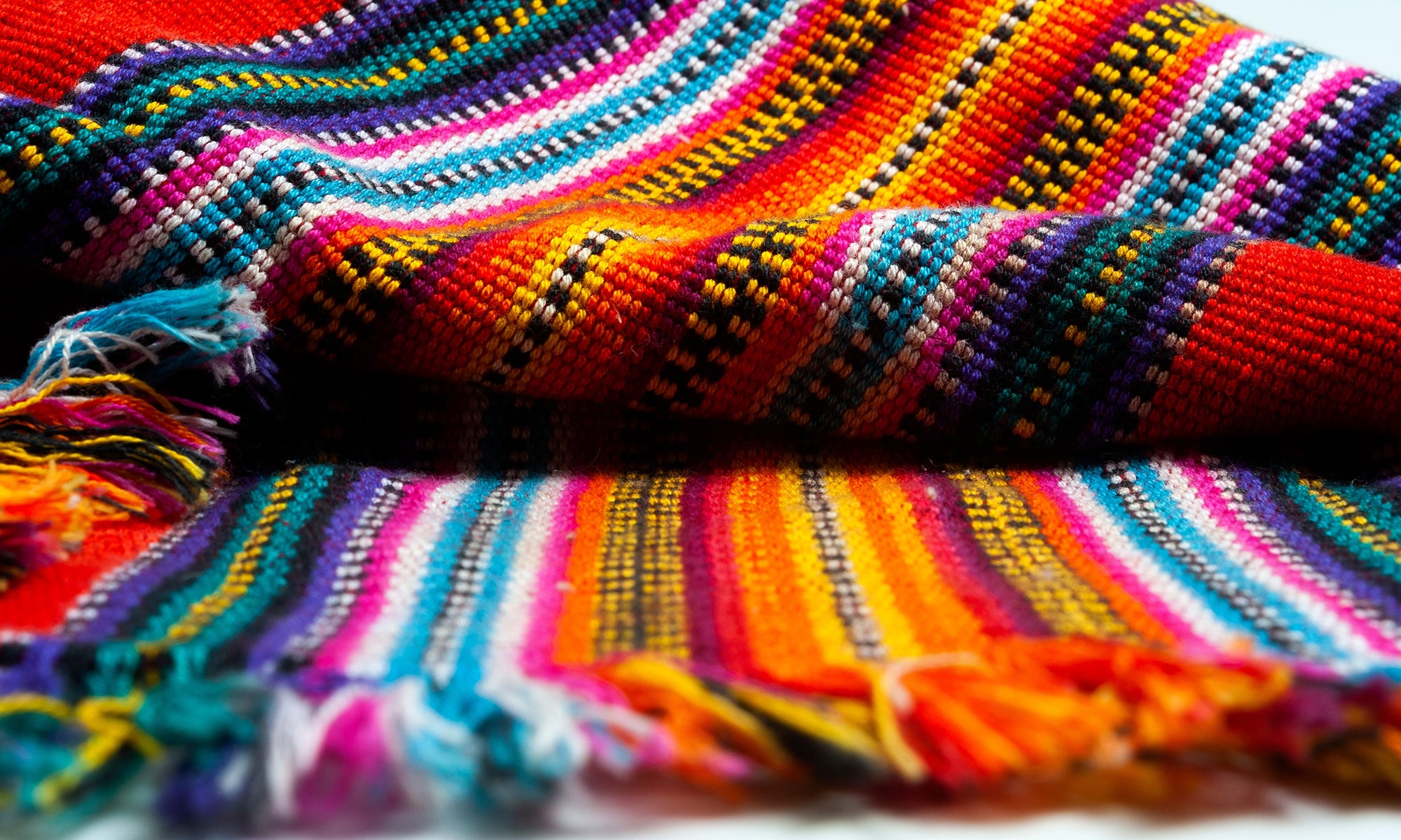
Colour is one of the most important tools in the creative brand development toolkit when it comes to developing your brand. It can have personality, character, warmth, charm, tone and hidden depths that can unify your message with the visual. It can be present in photography, illustration, decoration, livery and signage as well as printed collateral and digital collateral.
To ignore how valuable colour is in creating meaningful relationships with your audience is to ignore a free, non-verbal asset that is waiting to be unlocked.
What is colour?
Colour is fundamental to our understanding of the world, from the glowing fire escape sign to the eye and skin colour of our family and clients.
Colour is an inescapable result of light and during most of our waking day, we are surrounded by different light forms. The sun, fluorescent lamps, filament light bulbs. And the light from these sources will all be reflected off of surfaces and materials that have different textures and qualities that alter the light that we see as colour. We see sunlight predominantly as white light – we know that this is made up of many different colours and they become visible when we have sunshine on a rainy day – we see a rainbow as the droplets of water act like tiny prisms breaking up the light into its component parts.
Sir Isaac Newton demonstrated that if you recombined these rainbow colours you would actually see white light once again. In effect, he was showing us the different wavelengths. Red has a long wavelength and blues and purples have shorter wavelengths with yellows and green in between, so the wavelengths passing through the prism bend at different angles and therefore become visible separately.
An object that we see as red for example a ripe strawberry, is reflecting the longer (red) wavelengths and absorbing the mid (greens) and higher (blue). These longer wavelengths, reds, pass into our eyes, hit the light-sensitive rods and cones of the retina, and those wavelengths of light are translated into signals that race along the optic nerve to our brain’s visual cortex and we register that as red – so technically the strawberry is actually a Green Blue colour!
Light is the source of all colour. Wherever there is light there is colour, where there is no light colour is lost to us. On illumination, colour is everywhere but our perception of colour and what colour means is a very human experience.
A nonverbal communication tool
Colour is nonverbal in that we do not need to say, or write anything to gain a level of understanding from it. Assuming that the science, the physics and the functions of the light-receiving part of the brain is all in order the perception of colour and the individual's experience of colour will be “coloured” by many things such as experiences: first hand; taught; imagined, memories: good; bad; indifferent; exciting; frightening; romantic the list is endless. And what’s more we use expressions such as “colourful language”, “green with envy” or if someone is angry they may be “seeing red” whereas someone that is sad may be described as “having the blues”.
These associations however do not mean that everything we see bearing these colours have these traits. We “roll out the red carpet” which I am yet to see represent anger. So capturing a mood and an emotion with colour is an abstract idea and it is based more upon an individual's interaction with colour and the ability to accept idiosyncrasies of language as a guidance not fact. This means that colour can say a huge amount however it depends on many things such as the environment and context in which it is experienced, linguistics and culture. Remember the internet argument over the colour of the dress? Black and blue? White and gold?
Following trends
We think of influencers as being a fairly new social media thing. One of the first and probably most enduring on UK fashion and colour has to be Queen Victoria. In 1840 Queen Victoria married in an ivory-coloured wedding dress with lace framing the decolletage and a boned tapered waistline. Until then brides wore their finest dress – the colour and fabric of which was based upon their means. This royal occasion has had a long and lasting impact and today brides still prefer whites, and off white bridal gowns. In this context white represents virtue, purity, elegance, luxury, and status. These qualities are still broadly accepted in society.
In much the same way as Queen Victoria influenced bridal gown colours, brands, pop culture, and iconic people have long influenced our colour choices. Henry Ford is alleged to have said that You can have the Model T Ford in any colour so long as it is black.(1). Although Father Christmas was already depicted in red, Coca Cola took the idea and sewed the belief that they created the new look. They simply polished it up a little but made it their own. Marilyn Munroe and her blonde hair and pink outfits, Elvis Presley and his 1956 pink jackets and golden suits, James Dean and his red jacket.
Trends come and go but they can and do leave lasting impressions on what we believe colours to represent.
Emotion and our association with colour start to creep into our psyche at a young age. My son had a Beanie toy cat. When it got lost and was duly replaced by an exact copy. He was quick to notice that it didn't have the same dull time-worn colouring. We managed this with a tall tale of washing the toy. But it took a while for him to accept that the new toy had the same emotional gravitas that it once had.
In teaching children art I notice that the very young years 3 to 5 have an abandonment relationship toward colour. The more they use the better.
Unfortunately, the more colour they add the more they subtract the light from their creations and they end up with a slurry of wet paints closer to black. The same children in year 7 predominantly become very aware of colour and that using it liberally, raises attention to them and unless this is wanted – colour use is more reserved.
Owning Colour
Colour reproduction as we know it today had its birth in the 19th Century and lithographic printing made it possible for a level of consistency that had not been seen before. And as the consumerism of the early 20th Century took hold, products evolved at a rapid pace and brand owners were ever keen to ensure that they built enduring relationships with their audinces that were hungry to sample what they had on offer.
Bold colourful poster designs and packaging communicated emotion and style. Palmolive soap packaging promised to “Keep that schoolgirl complexion”. Hand-formed lettering and illustrated, stylized visuals were at times crude. Art Nouveau works by Henri Toulouse Lautrec, Joules Chéret Alphonse Mucha and Charles Renee Makintosh form the visual narrative with impactful colours and geometric layouts. Designers such as John Hassall loaned the Lautrec style and created famous works including his iconic holiday poster for London Transport to promote rail travel to Skegness. The poster depicts a ruddied portly fisherman with a pipe skipping along the golden orange sand with complimentary deep blue skies in the background with the title “Skegness is so Bracing”.
Just a few short years after this with the outbreak of WW1 governments employed bold poster designs with heavy blacks and reds to add gravitas to encourage signing up to fight. In between the two wars, the floodgates opened for creatives and organisations to employ designers and artists to promote commercial products, services or events. Some of those early brands that became successful used bold colours with a limited memorable colour pallet.
Heinz, OMO, Coca-Cola, Palmolive Soap, Shell Lubricating Oils, Kellog’s, BMW, Ford
The Art Deco period created some of the most eye-catching posters and packaging of the 20th Century and paved the way for modern product and brand development. Many of these brands took ownership of colours and presented them time after time and built a rapport with their expanding audiences. They built associates with the messages the colours and the experiences had with those brands – both good and not-so-good.
Organisations recognised the increasing value and importance of having a unique identity with colour and form, words and pictures and the combination of them when used thoughtfully could create clarity and understanding for the customer.
Consider the underground map that we know today. This was a visual mass of complex lines, colours and inconsistent letterforms until it was redesigned and a uniform style created to be used across all stations and printed information. This created a brand that was clear, precise, trustworthy and helpful. Edward Johnston's underground font is still in use today on London Underground station names with the iconic white text on a blue background with the red roundel.
New typefaces were created for consistency, in the UK – Times New Roman, Gill Sans to name two ensuring fonts. In Germany – Futura and Helvetica.
The emergence of reliable plastics as early as 1930, meant that colour was no longer confined to print, fabrics and paint it could now be applied to household items in abundance.
Today's technology places vast amounts of images and colours at our disposal at the touch of a button. The most difficult part is resisting the urge to use them all – being very selective and choosing a brand pallet that is authentic and has integrity as a representation of you and what you do.
So what colours do we choose?
There are several key basics to consider when looking at colours that truly reflect who you are, what you do, how you do it, and where and when you do it.
Your brand
- Your Value proposition; Unique, creative, traditional, classical
- Your brand personality; Friendly, professional, aloof, knowledgeable. gregarious
- Your tone of voice; Bold, impactful, reserved, precise
- Your brand values; What you uphold in all that you do
Your audience
We use this information to build up a customer profile and once we have a thorough understanding of this information we can start to look at the key emotional triggers that you want your brand and the visual representation of the brand to communicate.- Who are they? Male? Female?
- How old are they?
- What do they do?
- What are their likes and dislikes?
- What are their spending habits?
- Do they have children?
- Are they married?
- Where do they work?
- What do they do?
Armed with this information you are set to explore the ideal colour for your brand. This will lead you to uncover the Magic of Colour and how it can help create connection with your customers.
References
- My Life and Work Autobiography of Henry Ford. Written in conjunction with Samuel Crowther https://books.google.co.uk/books?id=4K82efXzn10C&pg=PA72&redir_esc=y#v=onepage

Share:
A Weightloss Adventure
The Perfect Brand Colour